This is a branding project developed for ADV 224: Intro to Creative Media. The assignment focused on building a fictional alcoholic beverage brand with a complete visual identity system and advertising campaign. Requirements included a logo, mood board, color palette, mockups, and a campaign presented across three distinct media formats.
The result: Lasso — a modern seltzer inspired by Western cues and shaped by a clean, minimal aesthetic. Designed to feel quietly confident and visually cohesive, the brand system spans digital, print, and environmental applications with consistency and style.

Logo
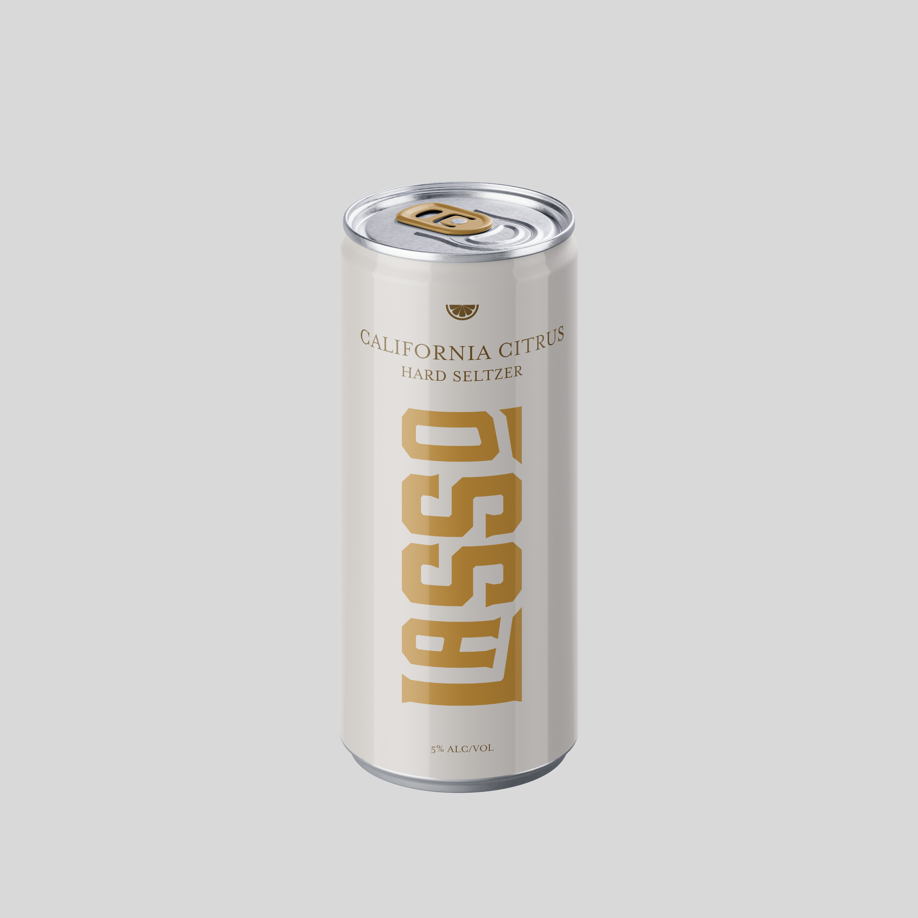
The Lasso logo began with the bold, Western-inspired Gin typeface. I redesigned the “A” into a high-bar variation, placing the crossbar near the top of the character, to echo the verticality and geometry of the other letters. To reinforce the brand name and add motion, I also split the bottom of the “L” across both sides of the wordmark with a subtle diagonal cut, creating a visual pull that emulates the movement of a lasso. Made in Adobe Illustrator.
Packaging
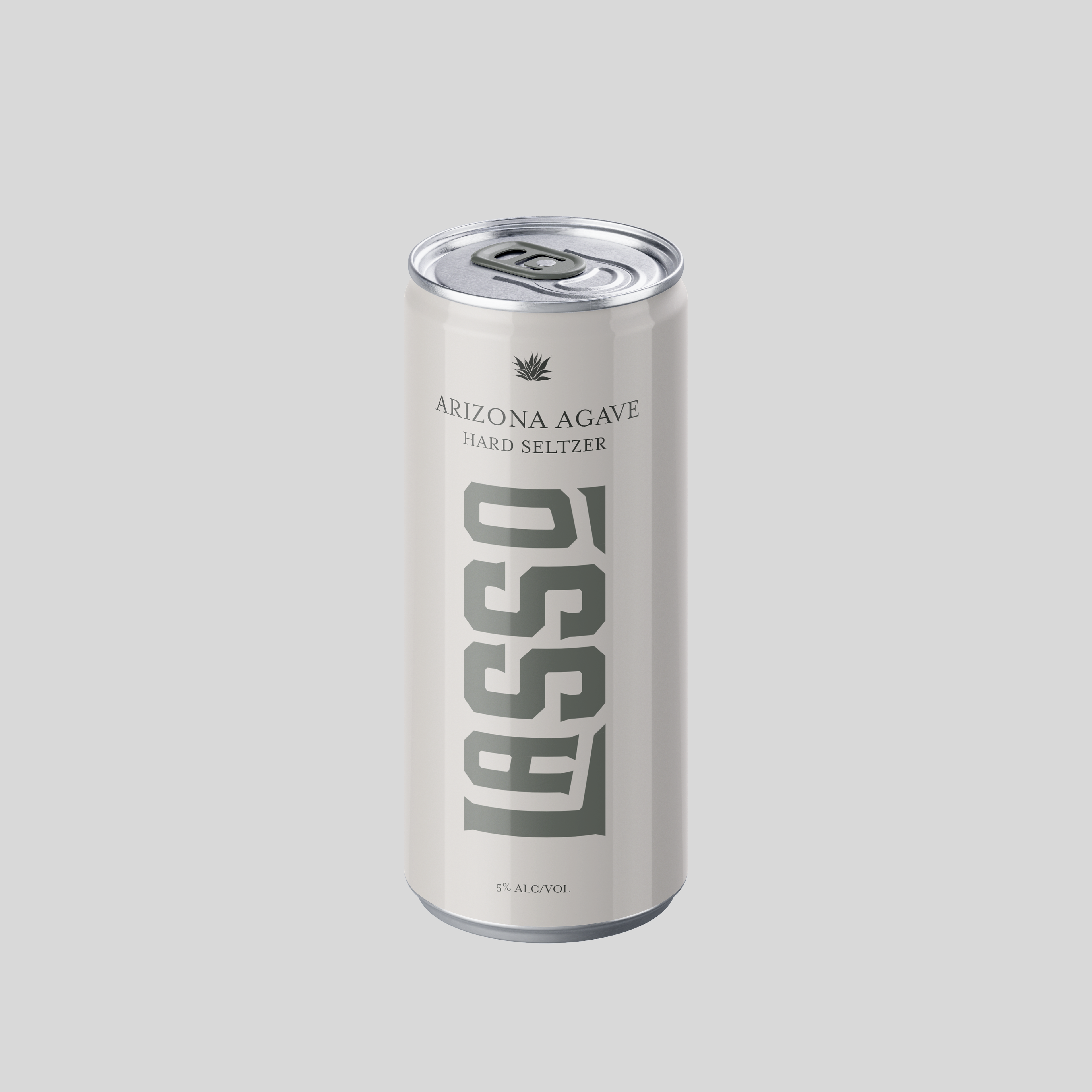
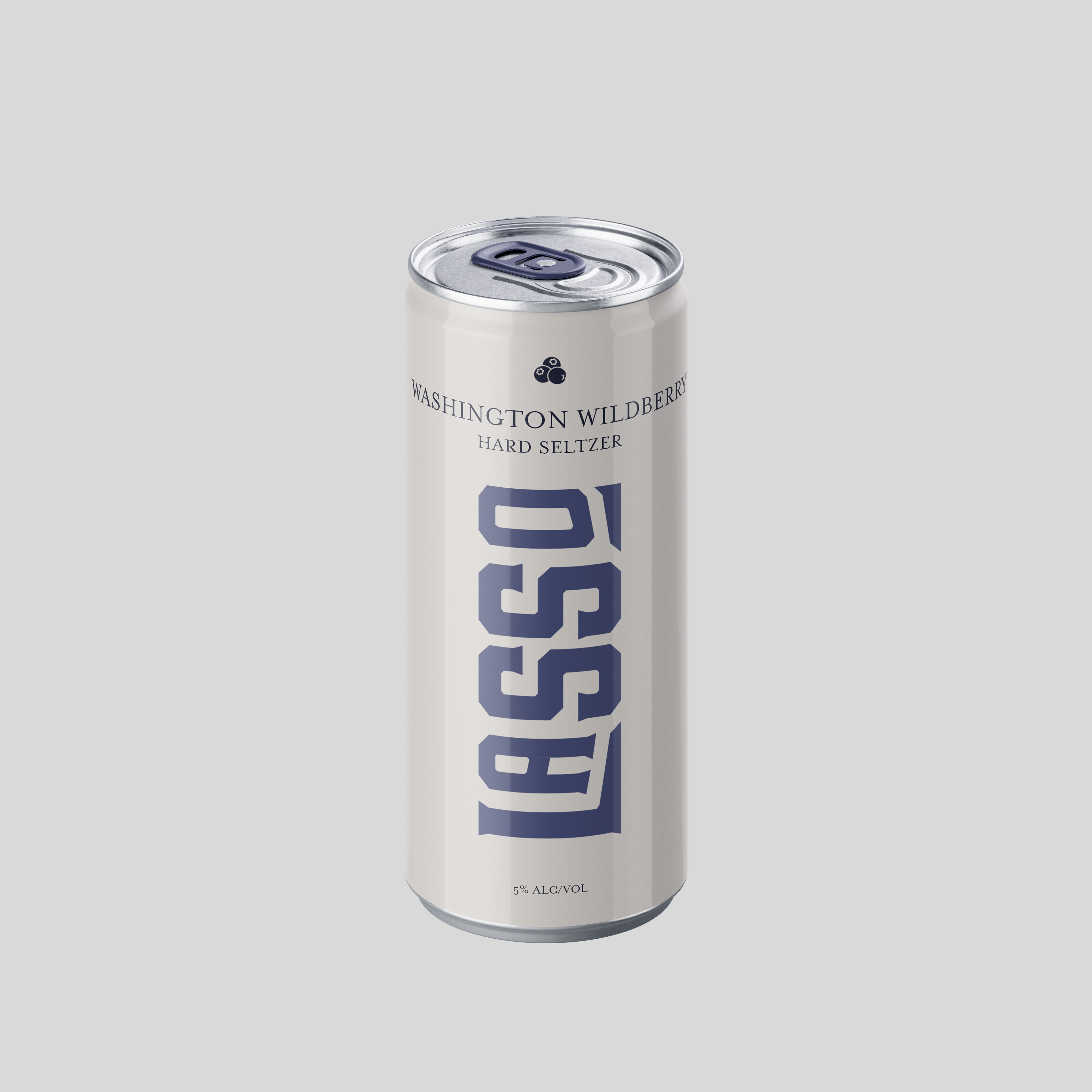
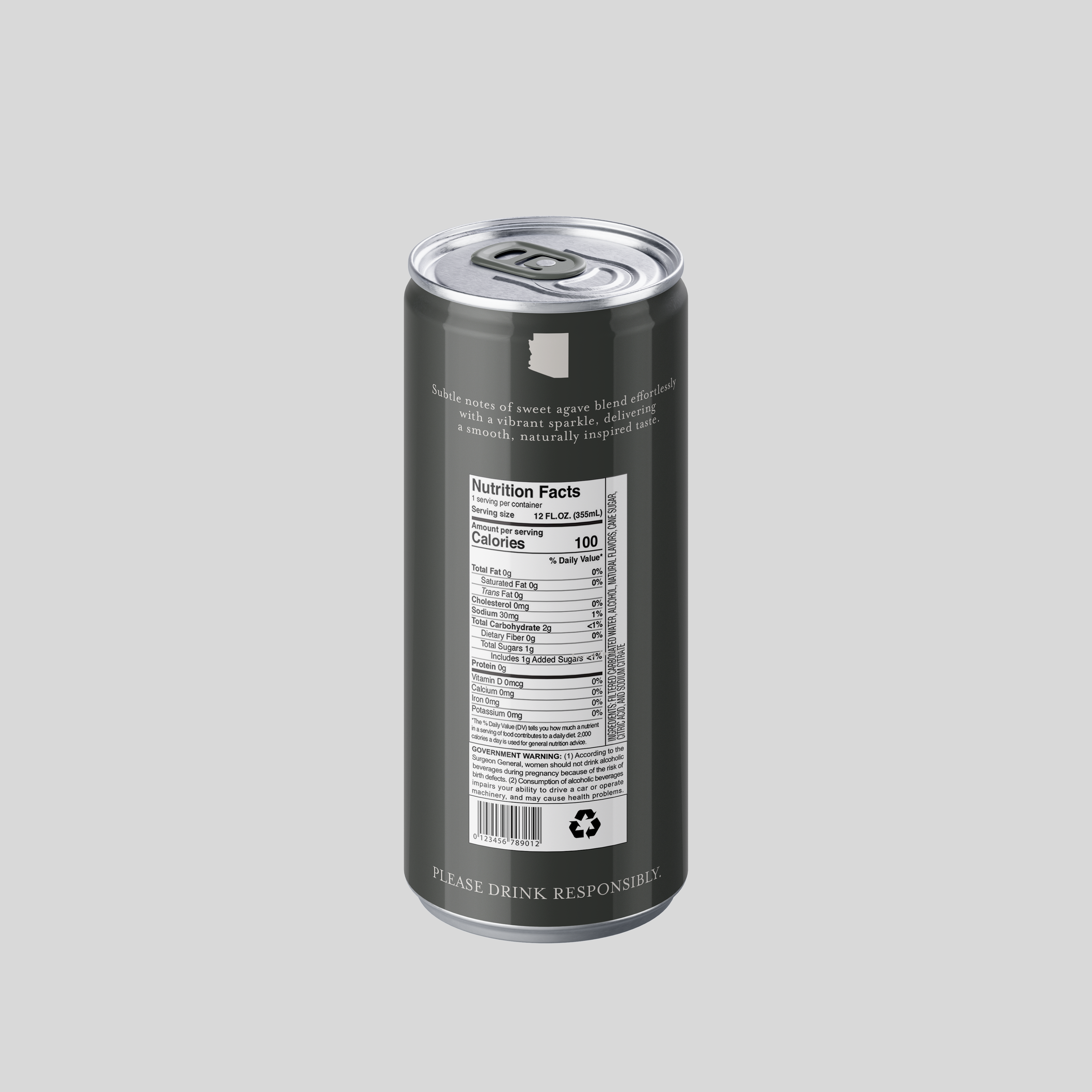
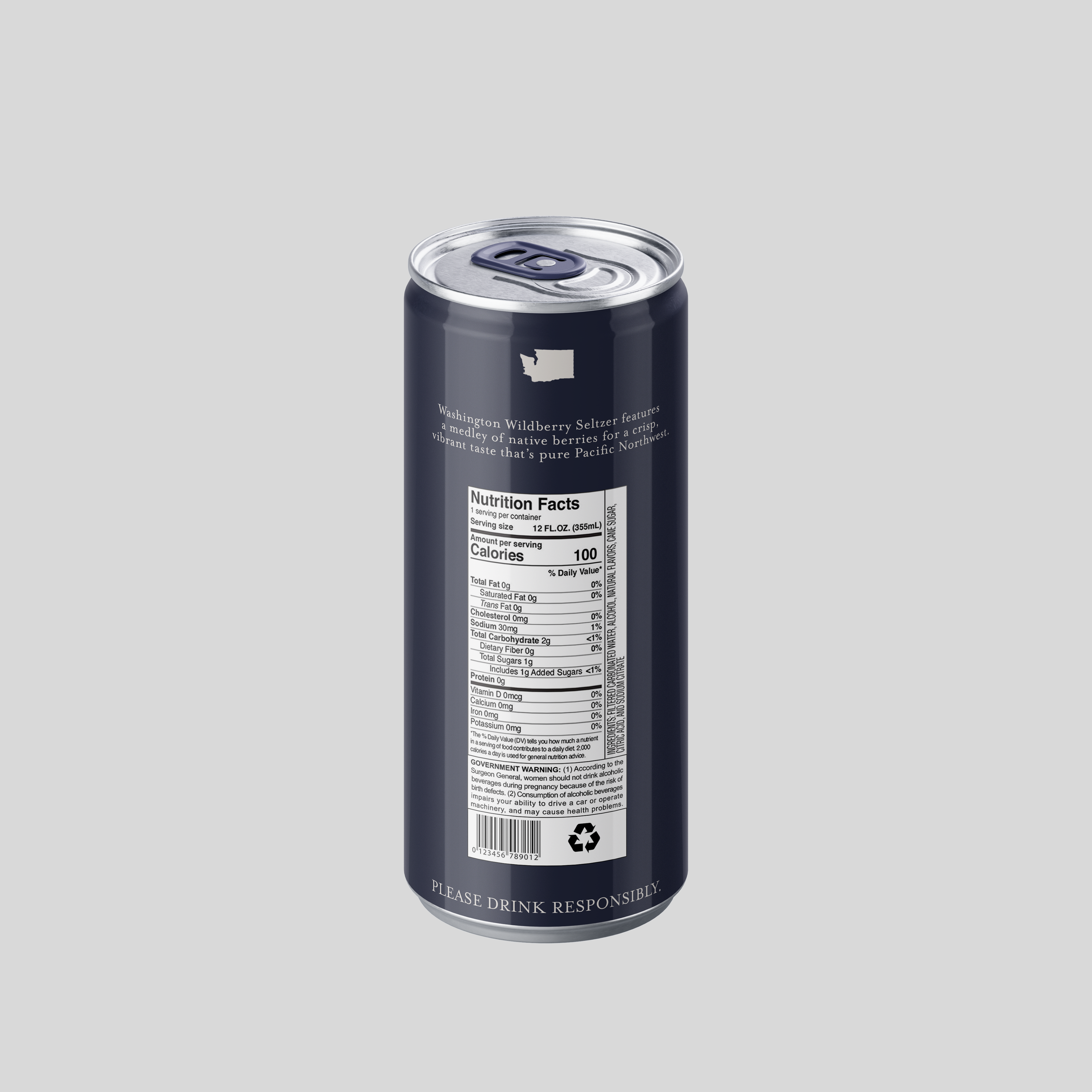
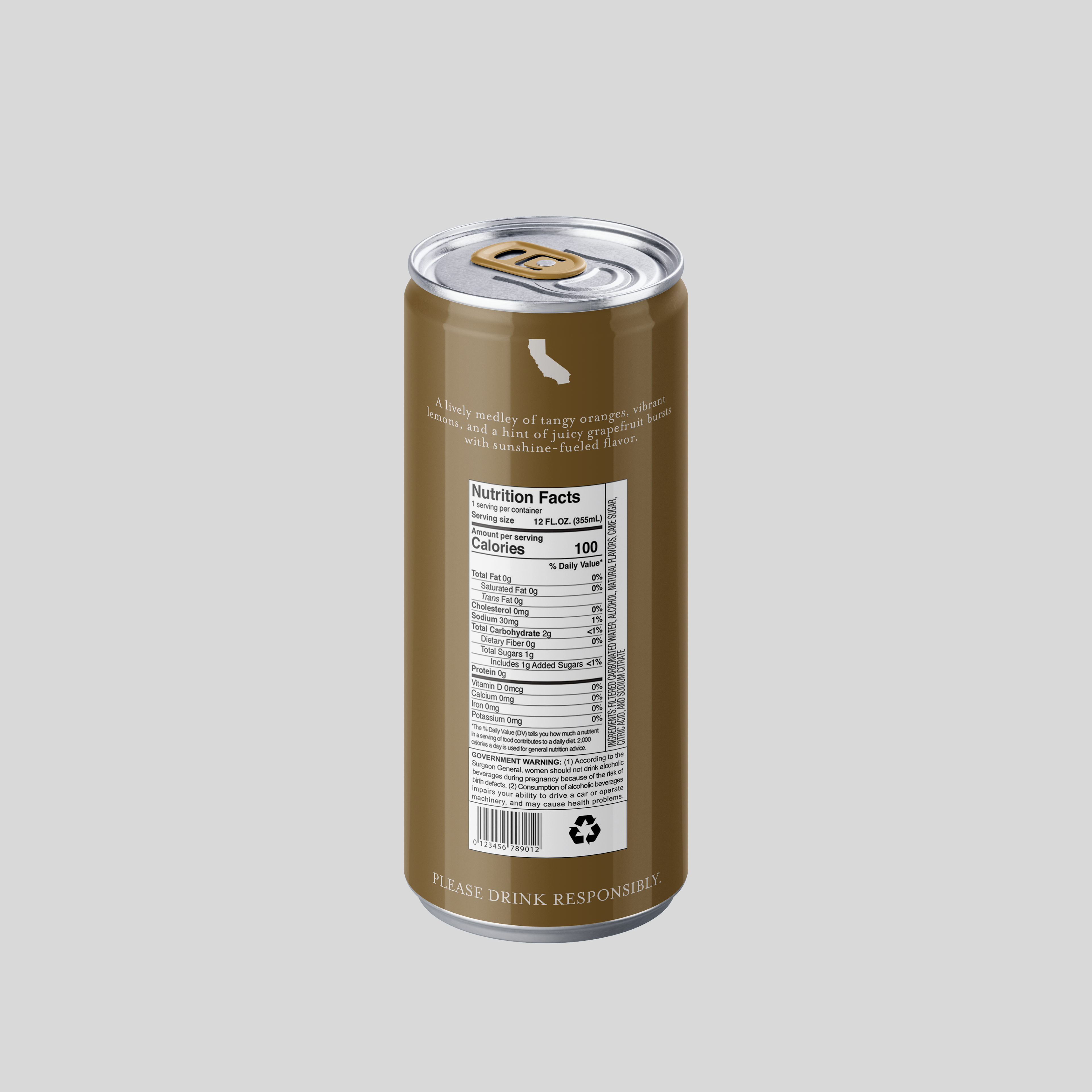
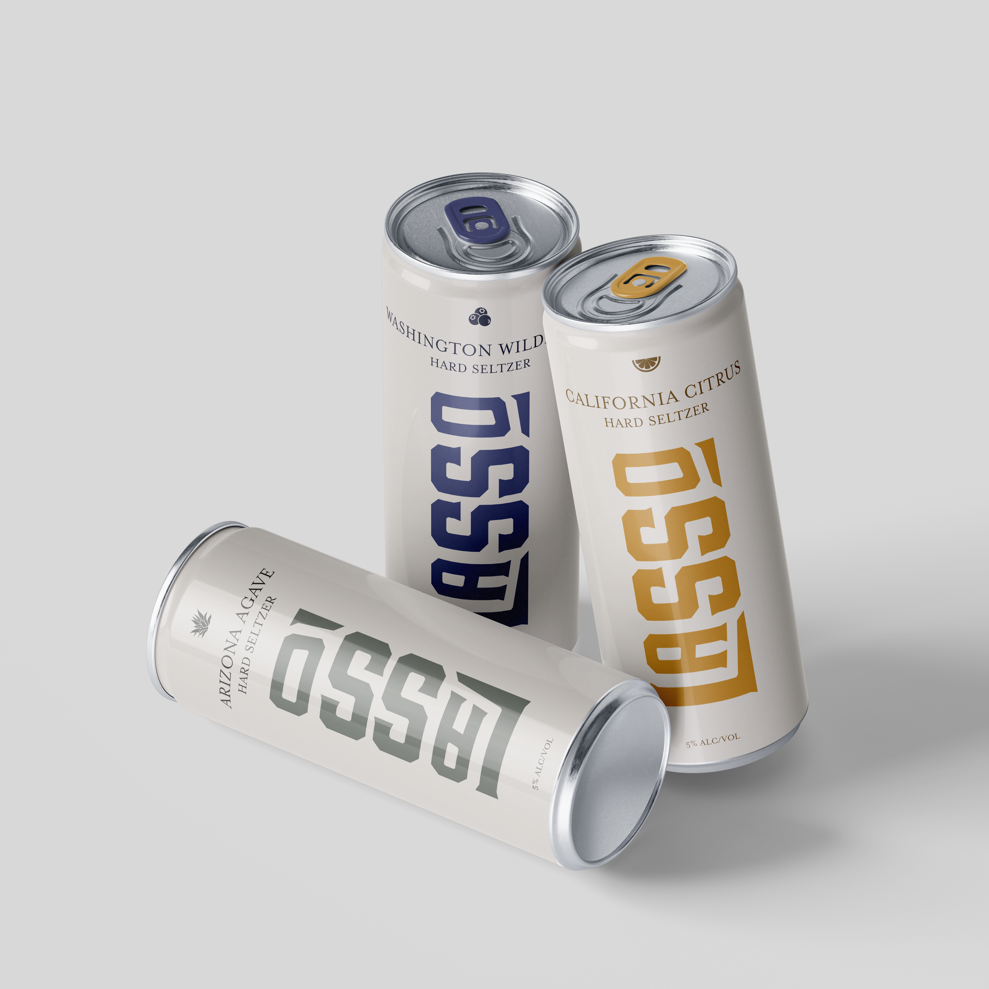
The Lasso hard seltzer lineup draws inspiration from iconic American regions—California citrus groves, Arizona agave fields, and Washington’s wild forests. Each flavor expresses its origin through a clean, cohesive design system. The vertical logo placement not only creates shelf impact, but also allows the brand name to remain visible when the can is being tilted to drink—turning every sip into a subtle brand moment. A neutral base palette keeps the system elevated, while bold, flavor-coded accents add distinction. Designed to feel modern, refined, and just rugged enough, Lasso lives at the intersection of minimalism and Americana.
Campaign
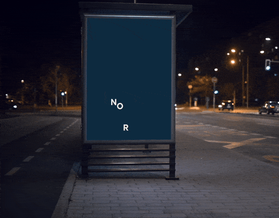
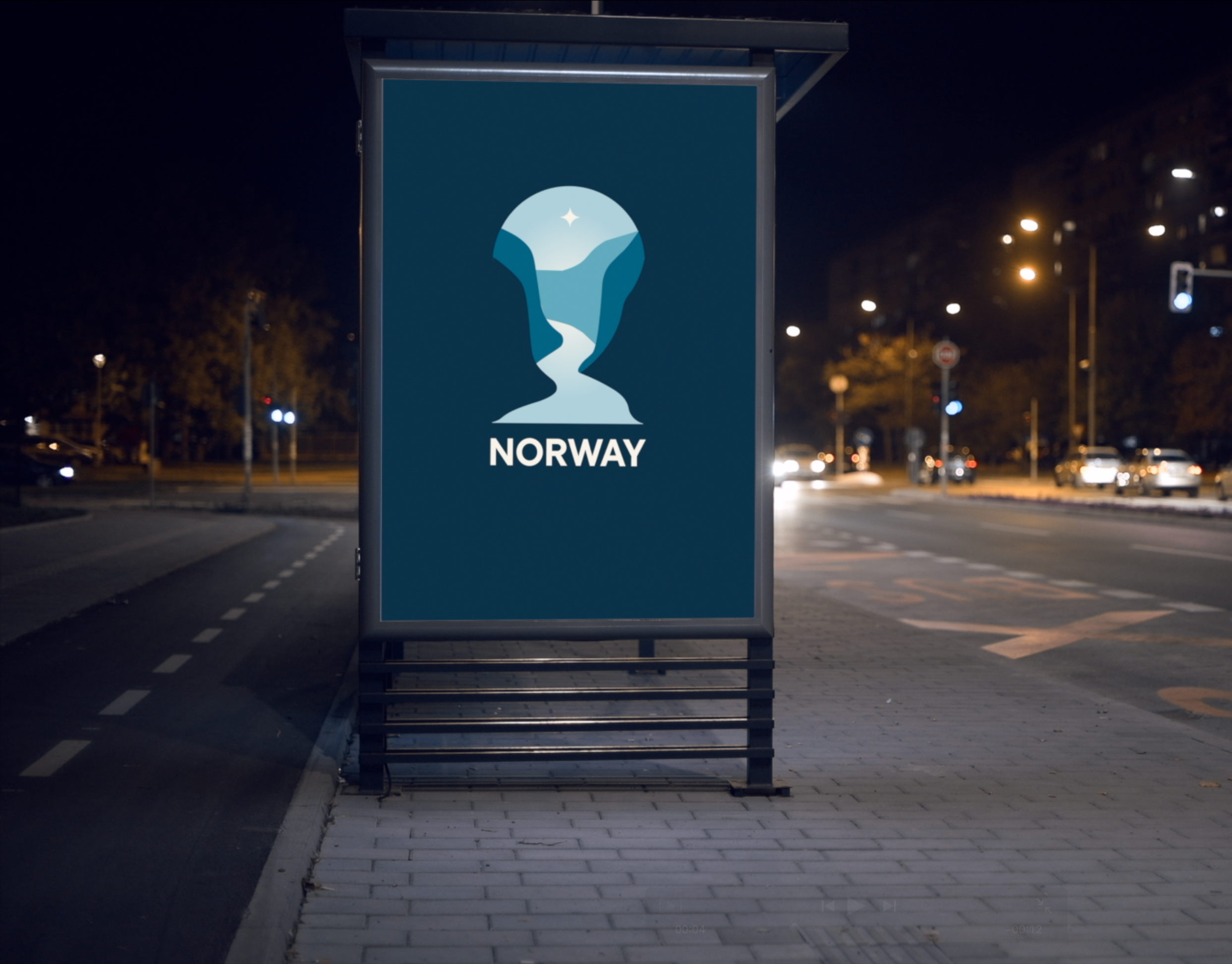
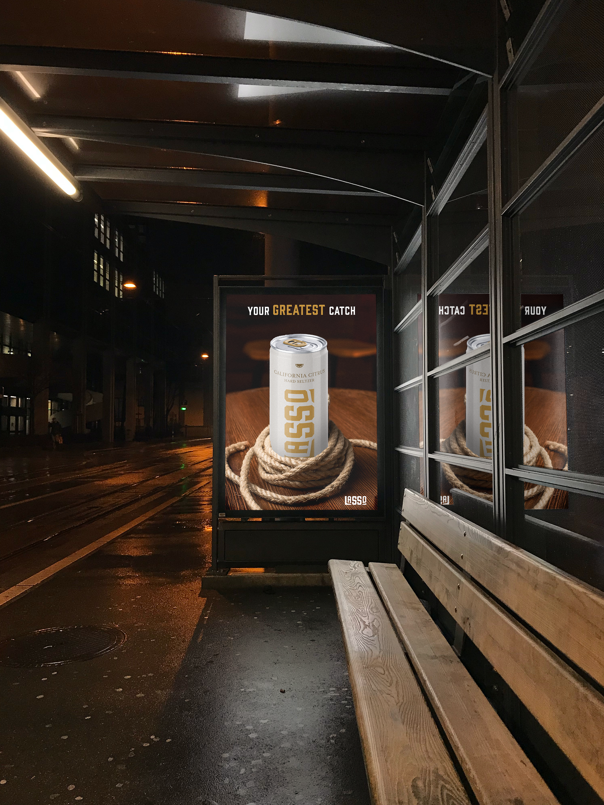
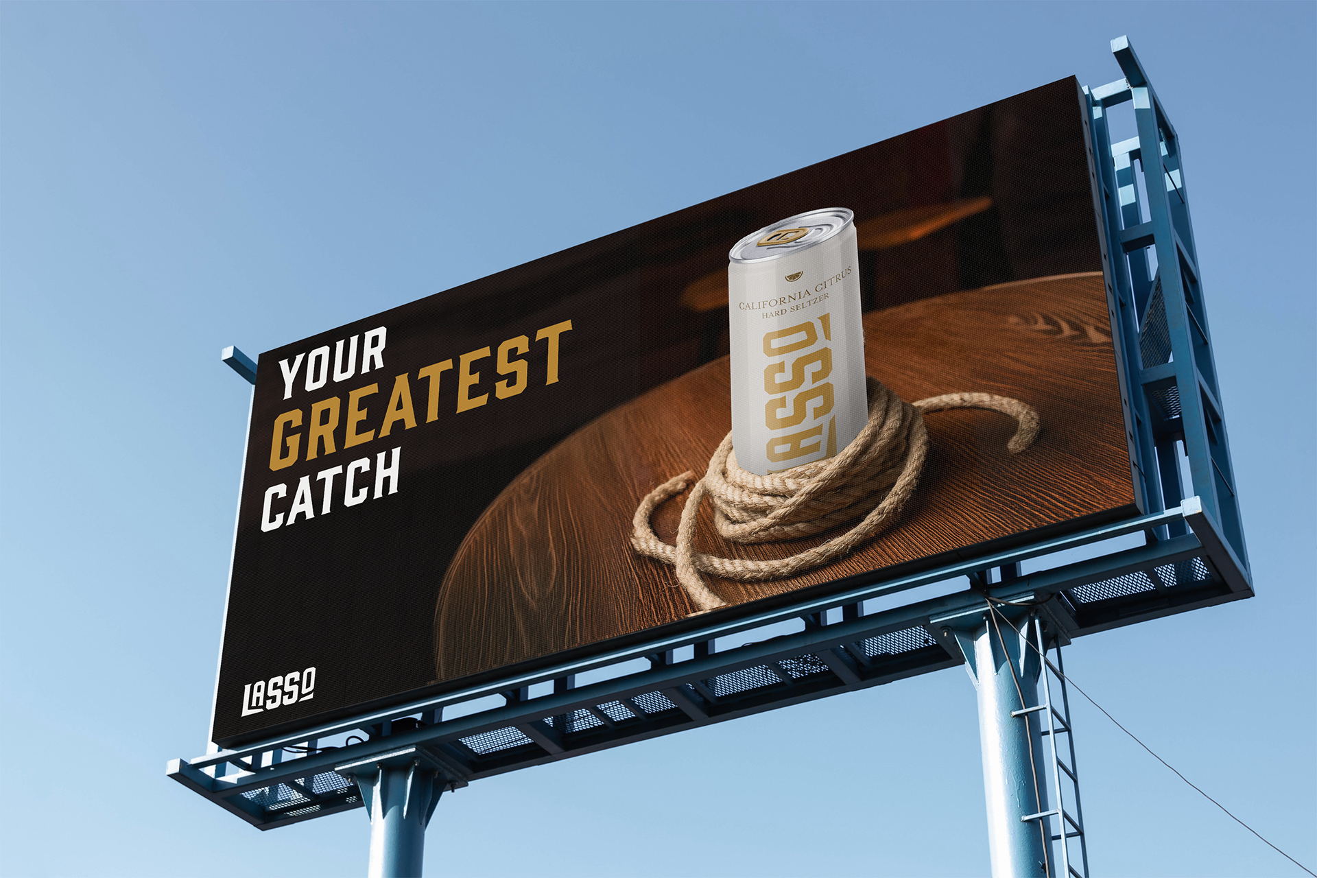
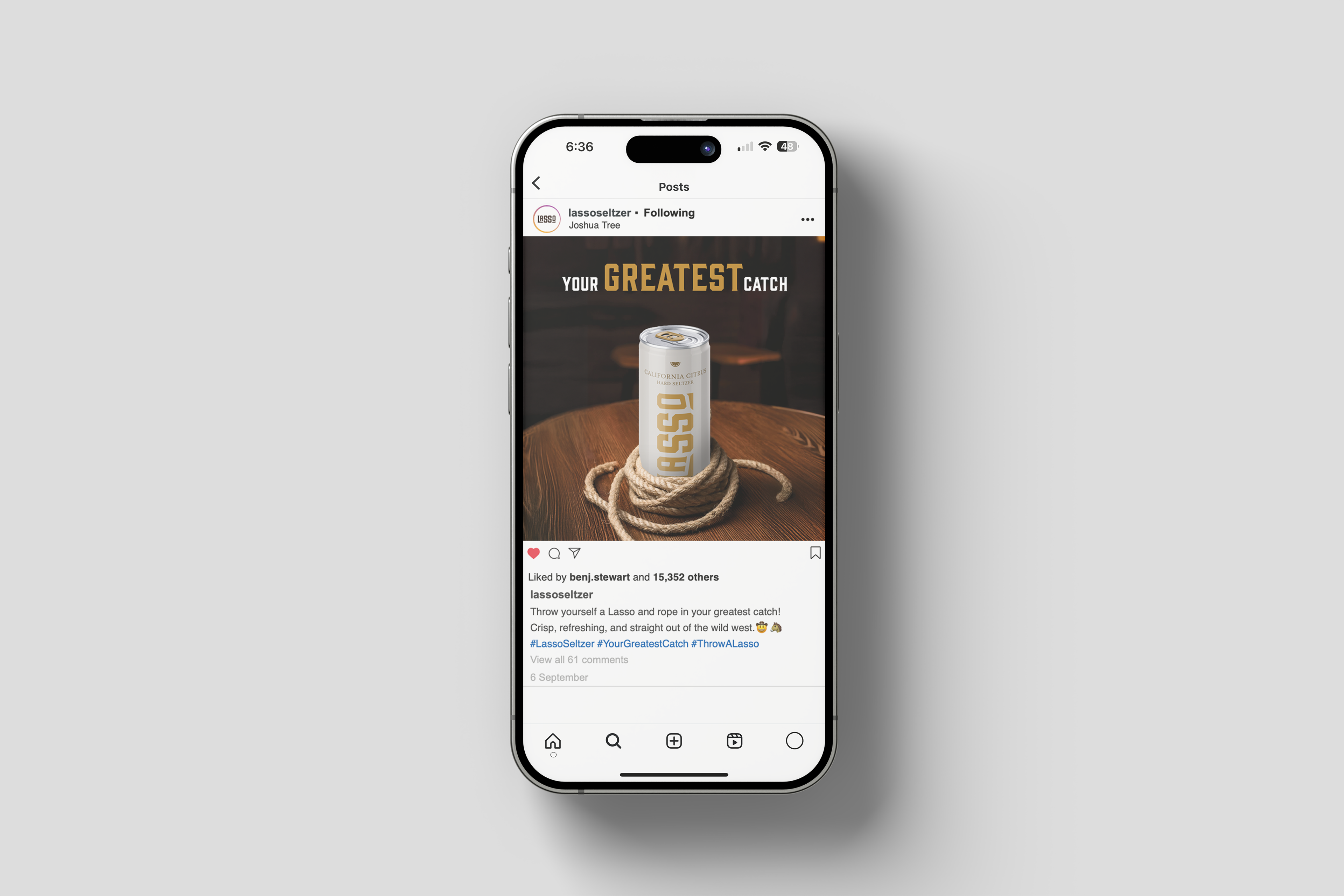
The “Your Greatest Catch” campaign builds on Lasso’s Western-inspired identity with a playful, confident tone rooted in the idea of discovery and reward. The visuals spotlight the product wrapped in a coiled rope—positioning it as both a prize and a nod to the brand’s namesake. The phrase “Your Greatest Catch” becomes a flexible tagline, balancing flirtation and function while inviting consumers to “throw a Lasso” and reel in their favorite flavor.
This integrated campaign spanned outdoor placements, transit shelters, and social media. Each touchpoint reinforces the brand’s clean-yet-rugged aesthetic, blending warm textures with bold type and minimal color. The tone is captivating, light, and modern, conveying the brand's position established from the start.
THE AWARDS
Student Bronze ADDY – Logo Design (AAF Lansing)
Student Silver ADDY – Typeface Design (AAF Lansing)
Student Silver ADDY – Packaging Design (AAF Lansing)
Student Silver ADDY – Packaging Design (AAF District 6)
Student Gold ADDY – Typeface Design (AAF District 6)